New Features in Power BI
Power BI Features:
In this blog, we will take you through the newly introduced features of the Microsoft BI tool. These features can be very useful while creating Power BI reports as well as Power BI dashboards.
Matrix Preview -: This feature was introduced in the March version of the Power BI desktop. To get this new feature click on files from their select options and settings and in that select options an options box will appear that select the Preview features from the left pane of that window
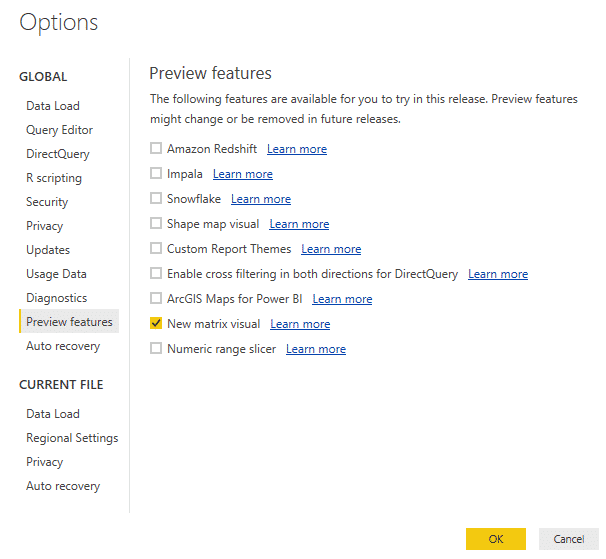
and then check the option New matrix visual.
After getting this new feature you need to restart the Power BI desktop application. Select the matrix preview option from the visualizations.
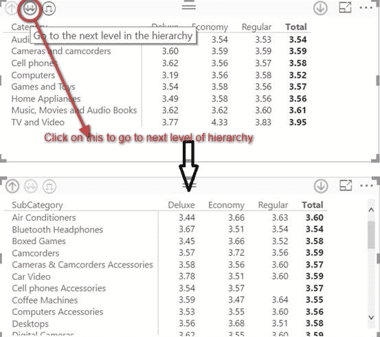
In this new feature, you can go to the next level of the hierarchy by clicking on the button given below in the image. In the image attached below when you click on that button you drill down from category to sub-category level.
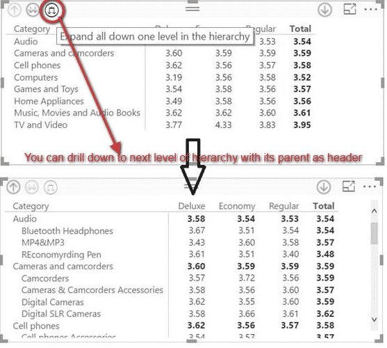
You can also drill down to the next level of hierarchy in this the data will be shown along with the headers. Like, in this case, the sub-category will be shown along with its category where the category will be the header.
You can also drill down to one specific category by clicking the button on the right side of the chart as it is done in the image below.
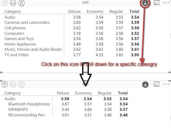
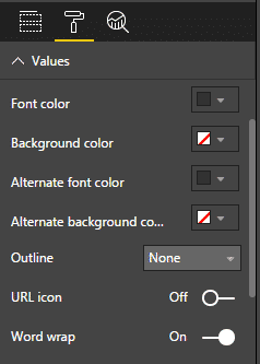
Table Preview -: The table preview feature has been introduced in the May 2017 version of the Microsoft Power BI desktop application. In this preview feature word wrapping for values of the table has been introduced. To enable the word wrapping feature to go to the format of Table Preview and inside Values enable the option of Word Wrap
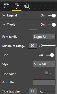
Axis Title-: This feature was introduced in the April 2017 update of Microsoft Power BI. In this feature, you can rename the axis title as per your choice. Earlier the axis title uses to be whatever the field name was selected for the chart. To enable this feature in the format option select Y-axis or X-axis and enable the title option inside it and give an appropriate name to that axis.
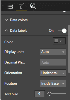
Data labels in combo chart -: In this update which was introduced in the May 2017 update of Microsoft Power BI. In this update, the user can set the orientation of data labels in which there are two options which are horizontal and vertical. The user can also change the position of the data labels within the multiple options that are available such as Auto, Inside End, Outside End, Inside Center, and Inside Base.
These are some of the new features which we have covered in this blog. As we have mentioned in our previous blog that there are monthly updates that keep being released and will be sharing all our experiences in using the Power BI features from time to time.
We hope you like the blog and share it with your network.
Please reach out to sales@bistasolutions.com for any query pertaining to Power BI, business intelligence, or analytics solutions. Also, do visit our interactive BI Dashboards Click here


